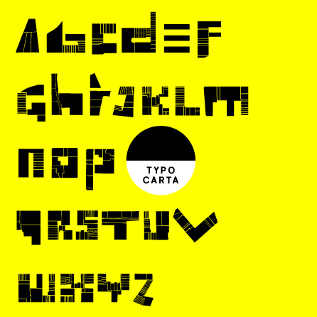
When conceptual projects go online, it is crucially important that the online identity properly embodies aspects of the physical project. Emulating either the philosophy or the aesthetics of the project, font-type is a highly visible way of communicating project identity quickly, easily and memorably. With this is in mind, it is appropriate to consider Michelle Champagne's Properties Font – “the urban minded, site-specific, typogeographical” typeface which represents and heads the Mediamatic Travel site.
With hyper-locality in mind, Champagne explained to me that it was the philosophies of urban theorist Jane Jacobs that motivated her creation. Jacobs is known for her adamant support of small scale localities, and properties font reflects this Jacobian aspect with its urban deconstruction. By fragmenting certain neighborhoods in Jane Jacob's pet-city Toronto (namely Distillery, Corktown and the St.Lawrence), she created a type face alphabet that is ideal for mediamatic travel. Ideal because this font reflects the interaction between that which is local and that which has the potential for international recognizability. Mediamatic Travel relies on the fact there are many facets of culture which are hidden in the depths of cities; only known about and only accessed by a knowledgeable few. At the same time, however, Mediamatic Travel is driven by the assumption that this kind of local knowledge thrives when its locality is mediated onto the international plane. Properties Font attempts to represent this kind of philosophical motive in a visual way.
Aesthetically, Properties Font “doesn't follow orthodox city branding” because it performs a commentary and an action as much as it works to appeal to spectators. Champagne explained that working with architectural footprints in her font type reduced readability, but that this did not concern her for she was not conducting a typical typography experiment. The creation of the properties font was more an experiment in site-specific "typogeography". The creation of this type face brought together aforementioned elements of urban planning, but also political realizations about how "all cities are about power". Each city featured on Mediamatic Travel offers their own idiosyncratic cultural manifestation, yet Champagne is certainly correct to assert that all of them are alike because of their involvement with ownership, censorship, and autonomy. Furthering the connection, it is even more relevant to observe that Mediamatic Travel attempts to disrupt, or at least alter, the politics of power by empowering local culture jammers. Artists, and those attempting to make cultural commentary, are encouraged and provided with an unrestricted outlet for expression on Mediamatic Travel. This commitment to help disseminate genuine culture everywhere is reflected in Champagne's Properties Font, for it is realized on Mediamatic Travel.