Charles Joseph Minard 1869 “flow map”
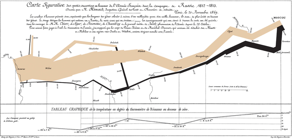
The Charles Joseph Minard 1869 “flow map” showing Napoleon's Russian unsuccessful campaign of 1812 was highlighted by Edward Tufte and others as an example of good data visualization. Plotting time on the x-axis going left to right and then right to left, the map displays not only the timing of the campaign but also the size and distribution of the army during its attack and retreat. The Charles Joseph Minard 1869 “flow map” showing Napoleon's Russian disastrous campaign of 1812. Popularized by Edward Tufte and others as a preeminent example of good data visualization, this diagram actually breaks the formal structure of a timeline running time both forwards to the right and back again. It uses graphics and color to not only show the passage of time but to tell a story (Rosenberg, 2004). Plotting time on the x-axis going left to right and then right to left, the map displays not only the timing of the campaign but also the size and distribution of the army during its attack and retreat.
Image available under Wikipedia Commons