For ages, type has been cast from hand-cut metal matrices (sculpture). In the second part of this century that changed rapidly from photographic negatives (photography) through electronically stored cathode ray tube images (video) into chunks of computer programming (interactive media). Well... interactive media... Although character shapes are programmed nowadays, most typefaces are as static as their lead ancestors. Till now. computer technology was only used to make type cheaper, faster, more available and more diverse.
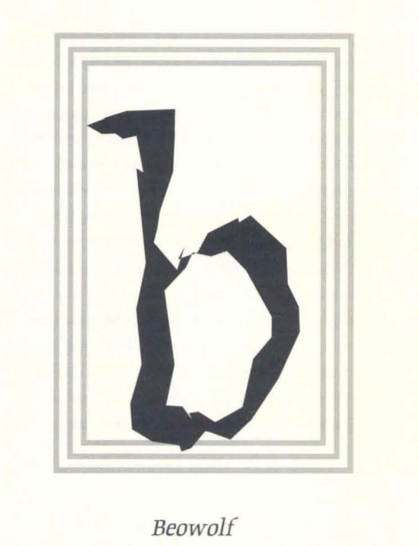
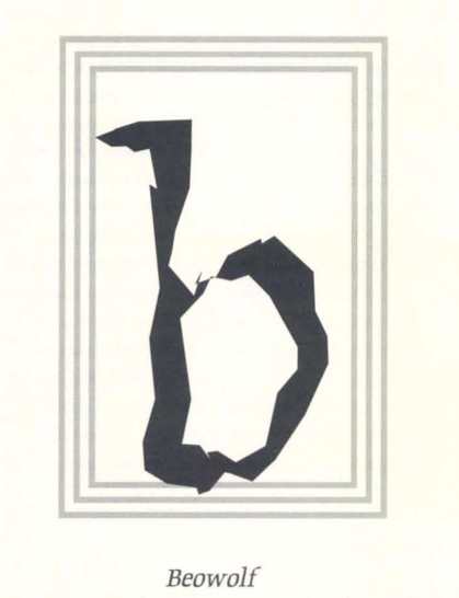
But finally the hackers are invading Letter Land! Young type designers Erik vanBlokland and Just van Rossum (Trained by Gerrit Noordzij an the Royal Academy in the Hague, The Netherlands) are exploring the potential of cybernetic type. Apart from their proposal for a typographic computer virus (FomCrime) they published Beowolf. a random typeface. By carefully introducing bits of random code in the Postscript definition of a rather classical, dutch font, they persuade laser typesetting equipment to change the form of each character each time it's printed. In its most moderate form (Beowolf 21. used here) this looks a bit like small prim on coarse paper. The medium version (22) is already a bit quirky, and 23 is really quite spastic. It is used for the headlines of this issue of mediamatic(shadowed).
Seemingly trivial and maybe aesthetically not very pleasing. Beowolf is of important polemical value. Van Blokland and Van Rossum proved it possible to partwith the rigidness that has characterized type since Gutenberg. If theforms of a character can be modulated by a random figure it also becomes possible to let a character interact with its environment, be it either typographical, semantic or semiotic.
Whereas nowadays the typographer worries about the exact spacing of neighboring letters, a couple of characters could get very intimate on their own! When interfaced with a natural language recognition system the form of words and sentences will directly reflect their meaning. This could result in better legibility (imagine reading and understanding twice as fast) or new forms of typographical expression (imagine reading and understanding twice as slowly). This is what type will look like in cyberspace.
Mediamatic Magazine vol 5#3 1 jan 1990
Beowolf
Erik van Blokland/Just van Rossum, a postscript typeface available for the Mac trough Fontshop (Berlin 030-241129, London 071-2535510, Toronto 416-3489837, Norwalf CT 2038463087) Berlin 1990