Q: To start, can you tell us a bit about your inspiration as a designer, learner and cultural entrepreneur so far?
A: I've always been fascinated by science. And actually the classical, quite conservative American typography of the Scientific American magazine has always been a reference in my graphic design work. The magazine basically translates actual scientific publications into something slightly more readable for normal folks. It's where you read about other people's science, for example, a medical doctor might read about archaeology, or an archaeologist might read about medical topics. It's one of the most interesting magazines that I had at home. My father had a subscription, and I loved that magazine. But it's not only because of its typography; at the time, I didn't realize that I was being influenced by its typography. I was just influenced by the monthly presentation of all interesting scientific articles, although I didn't read everything.
A: What was special about its typography?
Q: It's sort of an elegant classical clarity. Actually, I'm always disappointed when I find an old copy because I find it hard to rediscover what I found beautiful. But somehow, what I distilled out of it became something that I also like because it combines quite an accessible and non-confrontational design attitude with a curiosity for new scientific discoveries all the time. So, it was sort of organizing these treasures in a non-innovative way, making it very accessible.
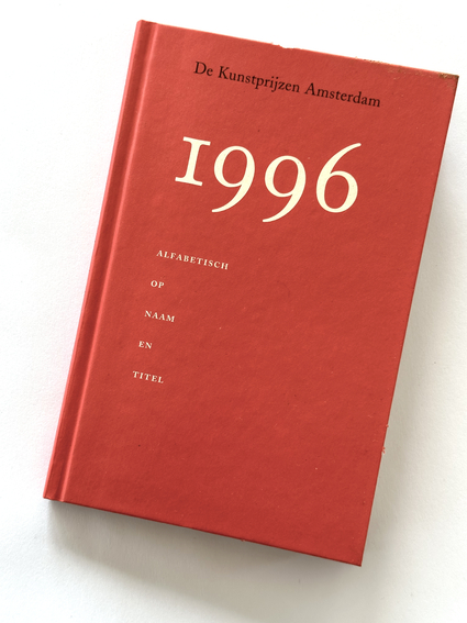
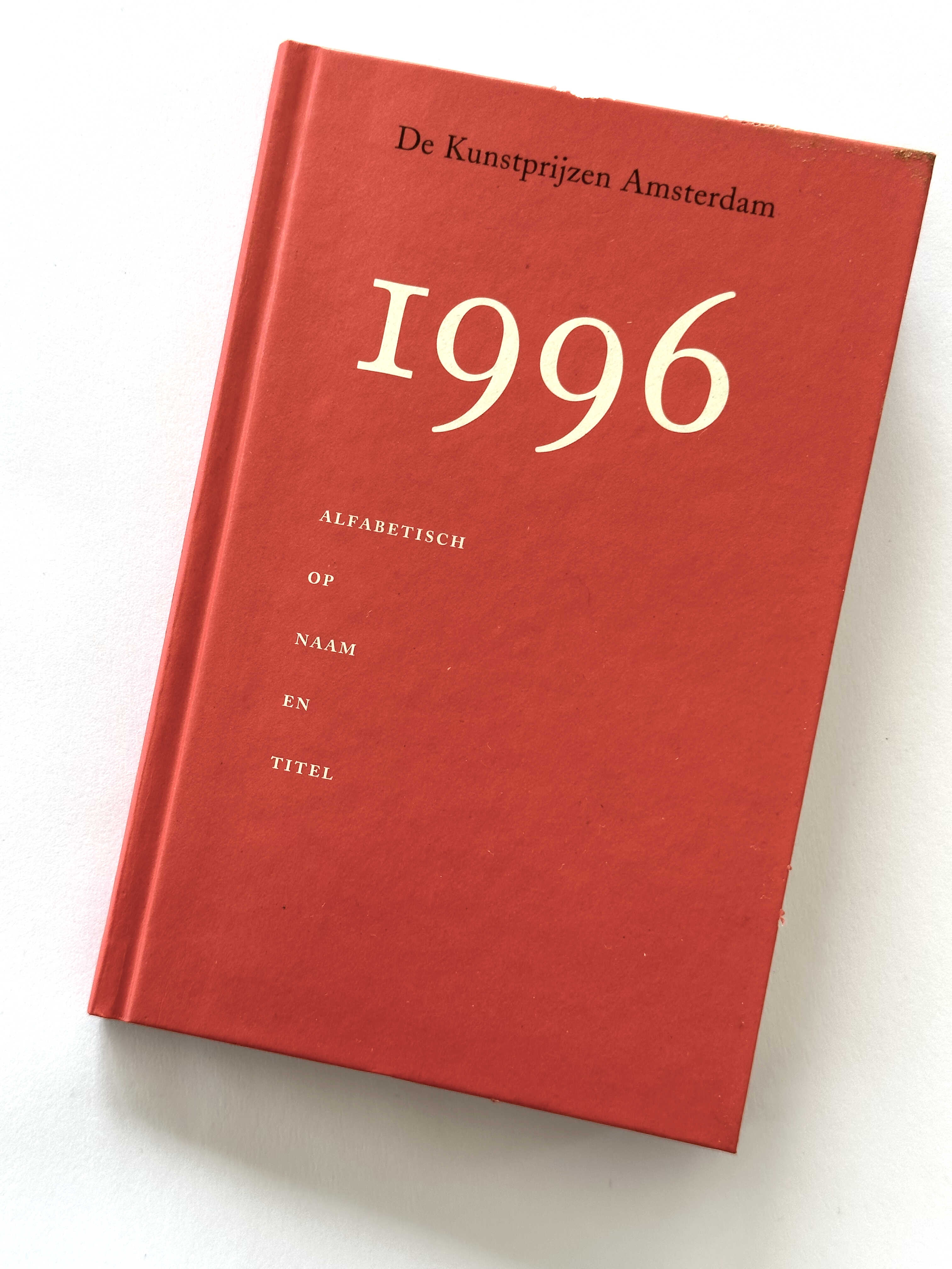
Q: Can you introduce the book 'De Kunstprijzen Amsterdam 1996'?
A: This is just a catalog of the Amsterdam art prizes. In those years, many people received prizes. I think it's reduced to three or four people receiving a prize every year now. But back then, it was more like 12 or 20 people. There were encouragement prizes and big prizes, and then prizes for each art discipline—graphic design, furniture design, architecture, poetry, dance, and more. Although I appreciate the idea of honoring artists and celebrating their contributions to society through awards, I always find it difficult to fully enjoy award ceremonies, whether it's the Oscars or any other prize ceremony. I prefer to focus on the work itself and have a somewhat detached attitude towards the whole prize-giving habit. I always feel a bit embarrassed when I receive one.
Q: So you wanted to design an unassuming little book?
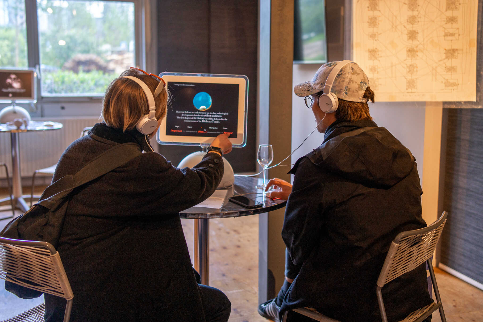
A: Yes, I thought it had to be a modest booklet. It's like checking up on your friends and yourself, sort of a vanity thing in this prize circus that decides how the jury's decisions are shown. But it's, of course, also because I enjoy the clear systematic presentation of information. So it's nice to make a little version of that. To have little rounded corners for a publication designed and built for heavy use. And yeah, small things. For instance, this book doesn't have page numbers. Very often, you see page numbers in books that don't need page numbers. So it's nice to make one that doesn't have them. One of the things that I liked about the internet is that it doesn't have page numbers . Actually search result pages have page numbers. But it's a kind of freedom that you're not forced to put everything in one single linear order. This is one of the most lovely and most cultural aspects of hyperspace. My personal development as a designer was inspired by the fascination in the 90s for hypertext, for linking everything to everything, understanding that the issue of culture is not linear but always interconnected.
Q: On May 13th, you will be a speaker at the event "The Artist makes the Idea that makes the Book" along with Robin Waart and A.W Doom, and each of you will give a presentation about books. What are the characteristics of your book and your practice that bring you together with these other makers in this event?"
A: We’re looking at a certain phenomenon in our culture and we’re looking for patterns. And as soon as we have discovered a certain interesting pattern, we can start testing that pattern by saying okay, let's make a rule about this phenomenon and see what happens if we execute it. So it's basically the same thing that science is doing, trying to make an understanding of something around you. Then you make assumptions about how that could be structured. And then you test it, see what happens if I follow these rules – do I get something that looks like where I started? Or am I just misunderstanding it? Do I have a totally different structure that I made up myself? You will discover by executing it.
Q: You're a designer, Robin Waart and A.W. Doom are artists – how would you describe the difference in approaching a book project?
A: The difference, of course, is that I didn't choose the content. I just work as a designer, so I'm serving someone else or another team that chooses the content and I'm trying to work with them to present it in the most worthy way. In the most attractive, but also the most insightful way. And when you're working as an artist, you choose your own content. So then, the whole thing becomes much more organically connected.
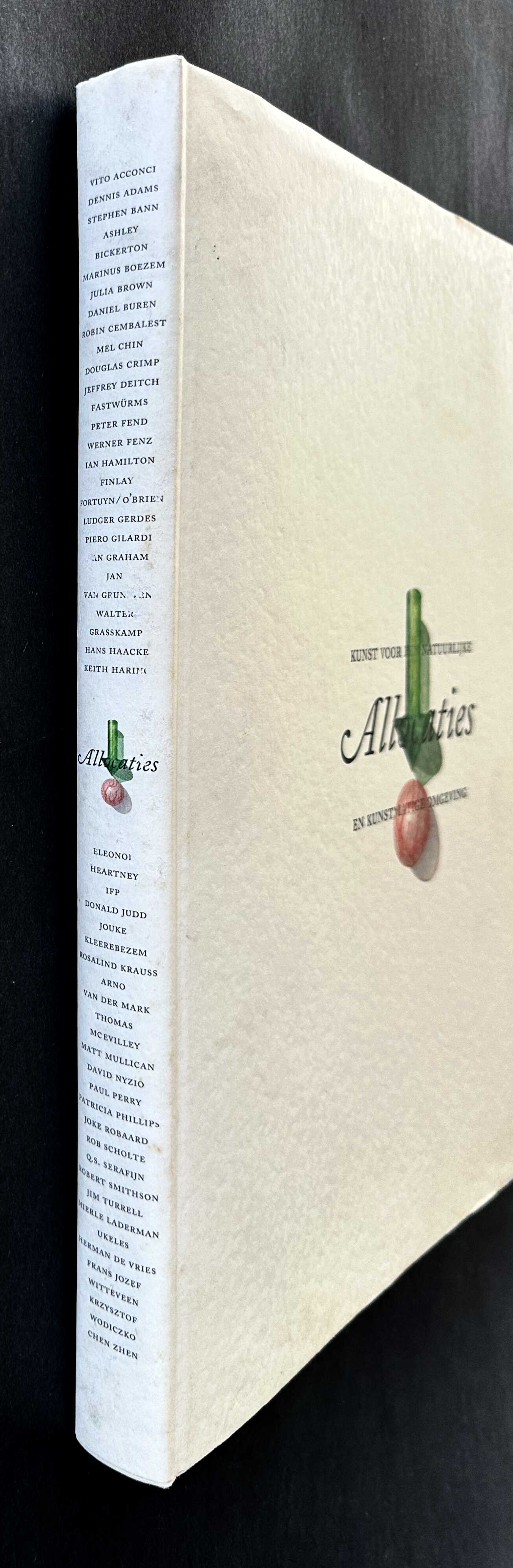
Q: How did this play out in the design of your book Allocations, the collection of contributions to the 1992 Floriade?
A: There was an editorial team that was making the exhibition, because it’s a very big exhibition held every 10 years and there was a big budget for art that decade. It was a really interesting combination of all these different artists, who were somehow making work relating to nature and, of course, also the culture in between. And as a designer I was already fascinated by hypertext, that everything could be connected, I was looking for how things in one text could be linked to other texts in the same book. So I argued with the curators, my clients, why don't we make a CD ROM? Why don't we make an interactive hypertext out of all these articles that you are collecting? And they said, no, no, we want a real book. We need to have something fancy, something chic, something that weighs more than a kilo. We have to celebrate the importance of this work, so please make a really nice book. But then I thought, I'm more interested in how I can make these connections visible. So in that conversation with the editors of the book, I asked him “can we decide which paragraphs are about which of the three topics that the whole book is about: art, nature, culture. And then we discovered that it would be difficult. So we decided that combinations would be the most interesting angle, and then I just started testing. What would happen if you would simply let the content decide its position on the page.

Q: But then someone did have to go through and annotate the content?
A: Of course, yeah, the editorial team went through everything, they had to go through it anyway. And decided just like, Okay, this one is nature, this one's culture. Arts and culture, this one's nature. Very simple, sort of like a hashtag per paragraph. Some articles are very consistent in their theme, they stay on one side of the page. Others are very jumpy. So you immediately see that there's a difference in the approach of these authors. And, of course, I encouraged them to give me lots of footnotes out of the same curiosity for these classical glosses. I wanted to give the footnotes a lot of nice space in the book, rather than hide them in the back or push them away to the bottom of the page. Give them room. So the liveliness of the layout comes from the content rather than some arbitrary designers’ playfulness.

Q: Would you say that giving the idea to the algorithm, and then that creates a book, is also about giving away responsibility to the 'machine'? So that when the outcome doesn't look conventional, for example when a new article starts at the bottom of a page, you don’t really have control over that. Is it a way of hacking your perfectionism?
A: It's not hacking my perfectionism, it's actually resisting the arbitrary prettification of design where everything becomes decorative, and everything becomes important, and the content is somehow not expressed by the shape of the actual design. So it's also a very, maybe even modernist attitude, where you say form follows function, but contrasted with a much more classical typography. But part of it is also to embrace the consequences of the system and enjoy that.
Q: In hindsight, what’s something from these books you took with you into your future?
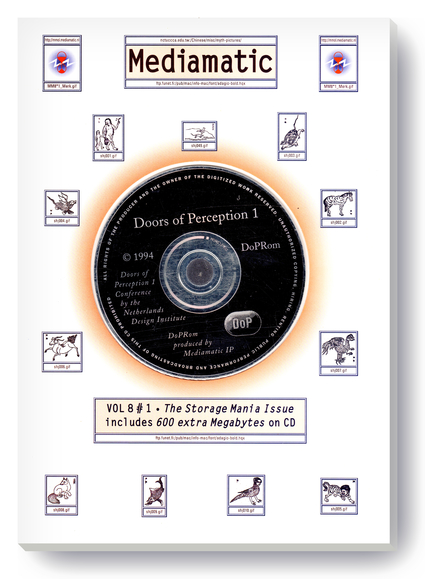
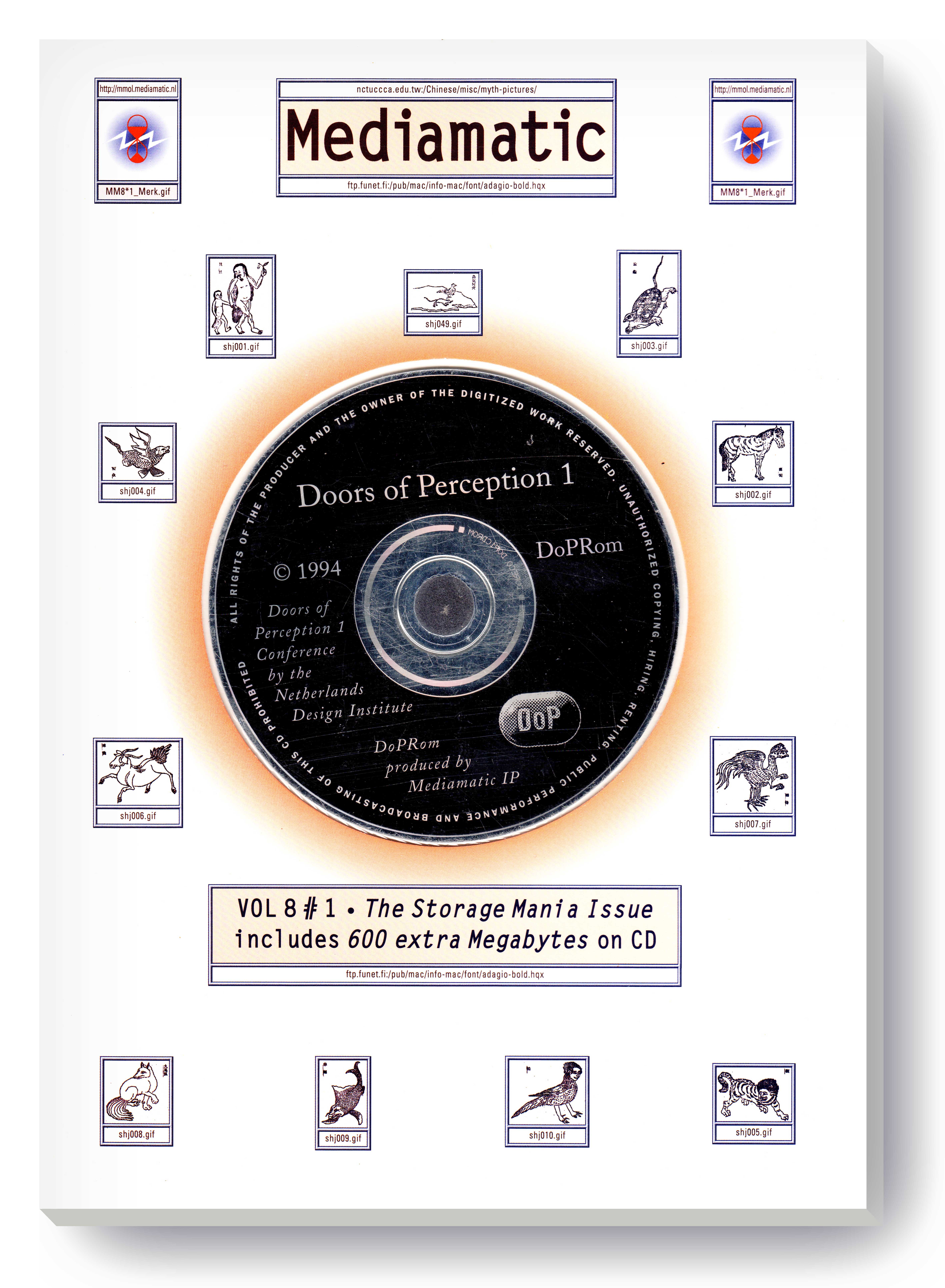
A: Well, at the time I was making money by making books, but I was not too excited about the prospect of making more books. Of course, I grew up with books, studying, reading… but books had been there for many years already, so I was more excited about the internet, and about interactive CD ROMs. In that year, we made the first Blind-ROM. And then in ‘93, we did the first Doors of Perception conference. That was in 94. And we were totally excited about all these new possibilities. Like wow, everything gets connected, and we can learn so much more, and we can find so much more. The first search engine didn't even exist then. These things were all happening in that decade. It was actually the moment where it became possible to design for interactive media. The first web browser had hardly any design. You would decide the typefaces at home. So there was actually no design possible. It really also looked bad, just raw content. And of course, it came out of a scientific way of thinking about information. Tim Berners-Lee who invented the World Wide Web, he worked at CERN. He was a particle researcher.
But the passion that is also translated into these books is looking at the whole knowledge space, and then looking for structures in there and trying to make connections in the cloud of knowledge. That is where the fascination is, how can you do that and what kind of new shapes come out of that?
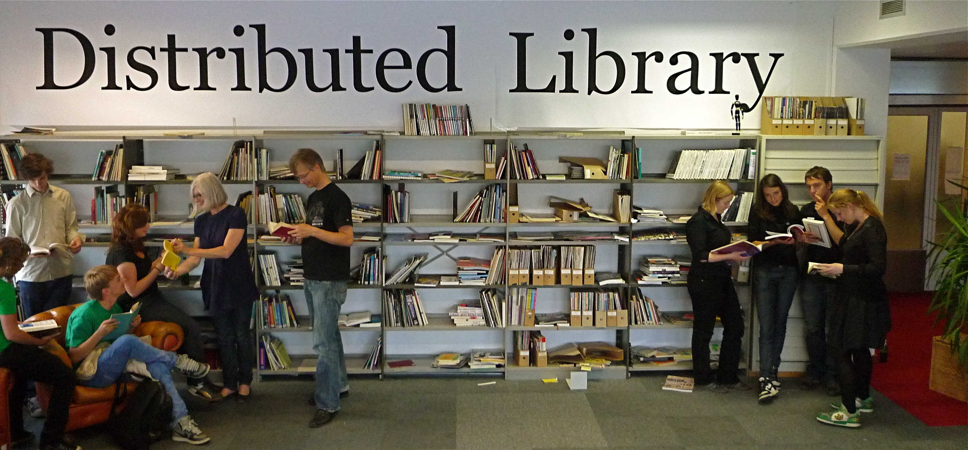
Q: Can you tell us more about Mediamatic’s Distributed Library project, and how it connects to the upcoming event on the 13th of May?
A: We did the Distributed Library early this century—yes, 2008. Like I said, we were enthusiastic about the internet and its possibilities, fascinated by the idea of everything being networked. One of the possibilities, of course, was that you don't need to have one building with all the books together, where you can physically find them. We realized we don't need to have a library anymore in a separate institution, so we gave away our books with the idea to share the books and knowledge about books between people who were all linked to each other through our website. So, to us, it didn't feel like having no money to maintain a library was something that we were worried about, we were actually quite happy. I also gave away my own book collection, it was not only the Mediamatic book collection.

Q: The idea was that you take a book and become its librarian, right?
A: Yeah. Everyone who really likes a book publicly advertises their curiosity for it and helps keep it available. That's the basic structure where love for culture, curiosity, and learning thrive. Everyone contributes a bit to the collection, making encounters with librarians meaningful. While it was portrayed partly as a protest due to budget cuts, we didn't view it negatively. There was a happy atmosphere during book giveaways. With the 13th May event The Artist makes the Idea that makes the Book, we hope to revive this spirit and celebrate our love and curiosity for books again, and maybe book lovers can once again find each other.
Q: To wrap up, can you talk a bit about how all this connects to the a/Artist project?
A: Well, I think, in general – there is, of course, the curiosity for scientific principles and scientific clarity and understanding how stuff really works. That is very closely related to autism as a group of mental traits. I think people on the spectrum often are more interested in these kinds of structures and principles than average citizens, and we also enjoy them, there is also a pleasure there. Not only scientific curiosity, but also an aesthetic appreciation.
This is, of course, something that you also find in the books of Temple Grandin, and Baron-Cohen, Visual Thinking and Pattern Seekers, who really argue that the advancement of scientific research is very much a neurodivergent hobby, a neurodivergent curiosity, to really focus on on a deeper understanding of underlying structures of things, to really enjoy being observant but also enjoy making catalogs of things. Or the example of this book, where the idea is that art is fantastic and we have to celebrate that, but the autistic designer makes an alphabetic overview.
Cover of 'Visual Thinking' by Temple Grandin - as found online at amazon.com . 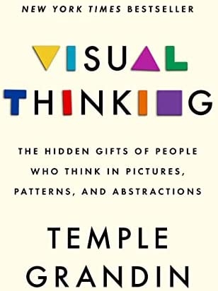