Mediamatic
  •  
  • Programma
    • Living Labs
    • Projecten
    • Artist Residencies
    • Recent
  • Evenementen
  • Workshops
  • Nu te zien
  • Restaurant
  • About
    • Over
    • Verhuur
    • Mensen
    • Vacatures & Stages
    • Archief
    • FAQ
    • Contact & Route
Zoeken Menu
Log in
nl
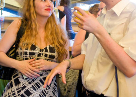
  • Afbeelding:

    However, Ann can also look quite humble and…

    Especially when she is inspired by a famous art critic Sven Lutticken. Sven was very upset that his name was written without the "Umlaut" in the exhibition catalogue. Sorry, Sven, I could find the...

  • error
  • Typografie
  • Kosher/Halal T-Shirt

    Also available as Halal/Kosher

    The shirt displays the word "Kosher" in Arabic script on one side and the word "Halal" in Hebrew script on the other. The shirt was made in 2 versions, one with Kosher on front and Halal on the back

  • How to make drawings with the Prophet Muhammad

    Stay-out-of-trouble tips for the ignorant Cartoonist...

    It's not so difficult to avoid making images of Muhammad and still have clear and effective visual communication.

  • Jarr and his Finish Flag

    What have people been bringing to our resistance archive?

    In this ongoing series, Objects and their People, we'll be writing about our favourite resistance objects, anecdotes and people. Keep up with what is happening in the Pièce de Résistance exhibition...

  • El HEMA in Den Haag

    Nieuwe tijdelijke winkel in het centrum van de stad

    El HEMA, een concept ontwikkeld door Mediamatic Amsterdam in 2007, werd een instant-hit. De El HEMA werd daarna geadopteerd door Kosmopolis. Na Rotterdam bezocht te hebben, is de El HEMA nu te vinden...

  • book: Nico van den Boogert 28 jun 2002

    inleiding in het arabische schrift

    This book aims to be an introduction to Arabic script. It uses big letters and assures the reader that several hours of concentrated study should be enough to master it.

  • Het Arabische alfabet

    Alif Baa Taa

    Het Arabische schrift speelt een belangrijke rol in El HEMA, oorspronkelijk bedacht als begeleiding bij "Typographical Matchmaking" een project van de Khatt (spreek uit Gatt) Foundation . De...

  • project: Chandra Brooks

    Block Printing & Wood Block Printing

    La Rate Blanche in the FabLab

    1) I am working with hand painted calligraphy to create flexible stencils on the laser cutter. The stencils will then be used to create prints which will not be recognizable as such. 2) I am...

  • Previously on view in the Amsterdam Biennale: Hugo Herrera Tobón, Natalia Domínguez Rangel

    Bogotá Pavilion

    The Bogota pavilion by curators Hugo Herrera Tobon and Natalia Domínguez Rangel opens 5 December 2009 in the Amsterdam Biennale 2009 at Mediamatic and on view until January 3, 2010. With artists...

  • book: Sluys jr, W.N. van der 1 jan 1942

    Het ABC der reclame

    "Reclame.... Propaganda.... Bestaat er wel een interessanter onderwerp, waar een auteur over kan schrijven? Juist in dezen tijd ?" Hier kunnen ze bij KesselsKramer nog een puntje aan zuigen.....

  • book: Dürer, Albrecht 1 jan 1965

    Of the Just Shaping of Letters

    de oorspron- kelijke Latijnse text komt uit 1535

  • magazine: Hans Dieter Reichert 1 jan 1997

    Baseline

    International TypoGraphics Magazine

    Een tijdschrift gewijd aan typografie, boeken kunst en grafisch ontwerp.

  • Persaandacht

    El HEMA in de media

    Televisie, radio, kranten en andere media

    Overzicht van media-aandacht voor El HEMA.

  • WatSpinoza? op het Damrak

    Wat is er mis met gevangenisstraf voor het gooien van kauwgom op straat?

    Op 7 mei 2009 werd de eerste WatSpinoza? vraag aan het Amsterdamse publiek gesteld. Aan het Damrak, vlak voor het Centraal Station, worden voorbijgangers gevraagd: 'Wat is er mis met gevangenisstraf...

  • Mediamatic Magazine Vol. 8#2/3 Willem Velthoven 1 jan 1995

    DoorMat FAT

    The DoorMat family

    For Mediamatic’s Home Issue, Dutch type designers Just van Rossum and Erik van Blokland designed a special typeface. The DoorMat family

  • book: Zapf, Hermann 1 jan 1960

    About Alphabets

    Some marginal notes on type design

    Het autobiografische verhaal en vakmanschap van fameus letterontwerper Hermann Zapf.

  • Simulacrum Journal October 2009 Privé ; for your…

    A glimpse beyond the interstice- separating the public and private domain Donna Wolf

    One often wonders, where the public domain stops and the private domain begins. Throughout history, the line of demarcation between public and private space has captured the fascination of artists.

  • Paint it Black

    Mike Giant joins Sur Place

    With Mike Giant we have caught a delicious fish for the Sur Place menu. Giant is famous as a graffiti artist, illustrator, tattooist and partner of Rebel8 clothing. Black ink is Giant's specialty and...

  • Openbare Kunst

    Claes Oldenburgh raakte in 2001 geïnspireerd door een grote hoeveelheid gigantische plastic ijshoorntjes die als reclame werden gebruikt langs de winkelstraten van Keulen. Toen hij van een...

  • Gentrification Battlefield

    ‏‪De niet-Noordeling rukt op in Amsterdam-Noord. 10 jaar geleden durfde alleen een enkele verkenner de oversteek te wagen om op de NDSM-werf een veroverde loods te bemannen.

  • BumbleBee

    zoomzoomzoom

  • Mediamatic Magazine 2#3

    maart 1988

  • Facadeprinter

    Verfballen slaan kapot tegen de ruiten: een kleurig teken van verzet.

    Zie een print kogel voor kogel - pixel voor pixel - ontstaan op de muur, als ware met een magische stift.

  • OV-Kunstkaart logo

    Download hier!

    Het OV-Kunstkaart logo is beschikbaar in eps-formaat. Dit is een bestandsformaat dat je eindeloos kunt schalen zonder te vervormen. Gebruik CMYK voor druk (C0, M100, Y100, K0) en RGB voor beeldscherm...

aangemaakt Katja Sokolova bewerkt Katja Sokolova

  •  Contact & Route
  • Colofon
Design by Mediamatic - Powered by Ginger