'Type is the tie or ligature between author and reader,' writes Hermann Zapf, "and it is much to be desired that readers become more critical and gradually more sensitive about the choice of type in a book. In this connection the question arises whether our modern book production shows generally that unity of content and form common, for example, among the books of the 15th and 16th and even later centuries. Why is this unity generally lost? And is it not an anachronism when Albert Einstein's relativity theory, or works by Bertrand Russell, Pasternak and other such are printed with types of historic design?...Books of historical content, books that seek to produce a certain mood or atmosphere in the reader, such books may continue to be set in historical or classical types—I do this myself in my own typographic works. On the other hand there are available so many devices expressive of our time that we ought not to banish them when we design books for our time."
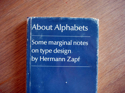
The designing of typographic devices and books "for our time" has been Hermann Zapf's central commitment as an artist. In this book he displays his art—he designed the book, which is set in a typeface of his own devising, Linotype Optima. The book is illustrated with type specimens from other fonts he has designed, and the text is both an autobiographical account of his artistic development and a statement of principles.
First published in 1960 in a limited, numbered edition by The Typophiles, the book is now presented in a revised edition for the growing number of readers, printers, and designers who have become sensitive and sophisticated in matters of type. They will particularly be able to appreciate the author's versatility of form and graphic statement as reflected in the type styles illustrated here, including such famous faces as Palatino, Melior, Saphir, Aldus, and Optima. Other faces are also illustrated, some embodying Greek, Cyrillic, and Arabic characters. There are in addition some double-page working drawings showing changes and alterations in the author's hand and several specimen page layouts.
