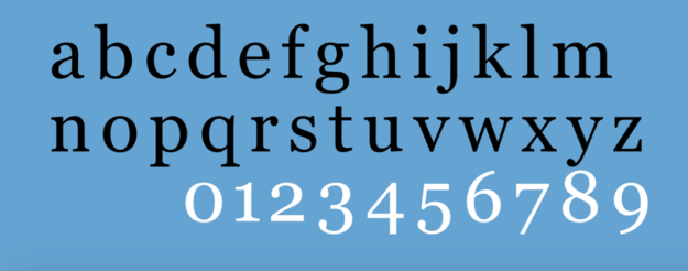
With an elegant but legible serif, Georgia can be read clearly at low resolutions with an uncompromised sense of typographic personality. This typeface is often reported to radiate a sense of friendliness and earnest intimacy, a testament to Carter's skill as well as to the intrinsic quality of Georgia's design (Microsoft, 2022).
Georgia has a transitional serif, meaning that it occupies the stylistic space between traditional typefaces and more modern styles. Many of Georgia's characteristics are reminiscent of ‘rational’ serif typefaces of the early 19th century, most notably Scotch Roman. Carter has revealed his admiration for Scotch, from which he borrowed the horizontal top serifs of many lower case letters. Georgia balances the charm of the old world with modern necessities for online design. To maximize legibility at any size, Carter chose to build Georgia as a darker typeface with a larger x-height, along with ascenders which rise above the capital height (Microsoft, 2022). Moreover, compared to Scotch Roman, Georgia's numerals are evened out and relaxed into their forms as well as slightly non-aligning. All characteristics which support the individuality of text set in Georgia.
Finally, what you have undoubtedly been waiting for: Georgia Italic. A clear favourite here at Mediamatic. Georgia italic is a graceful open font which effortlessly cloaks the degree of difficulty involved in bringing it into existence. Unlike many fonts, Georgia italic is a true italic, meaning it was designed from the pixel up and has unique features not found in the roman face. One such characteristic, and arguably the most important for its 1996 release, is its distinctive angle of slant. Along with original characters such as the single-storeyed lowercase a and g. Although this typeface has undoubtedly earned its notoriety, why do we, Mediamatic, employ it so enthusiastically? Well the answer is quite simple, it looks and works great, and it did so even in 1998. Georgia called many computers home shortly after its release, and after deciding that it was our favorite online typeface our printed content soon followed suit. To this day we are in a happily committed relationship with Georgia, and you can bet that we won't stray from this friendly-faced font!
References
Georgia Font Family - Typography. Microsoft Learn, 30 Mar. 2022, Accessed 10 Aug. 2023.
A Font Named Georgia. Firedezign. YouTube, 15 June 2010, Accessed 10 Aug. 2023.
“Italics.” Typography Deconstructed. Accessed 10 Aug. 2023.
“The Strange History of the Georgia Font.” Richy Lee. ThisIsIons.Com, 25 Nov. 2014, Accessed 10 Aug. 2023.