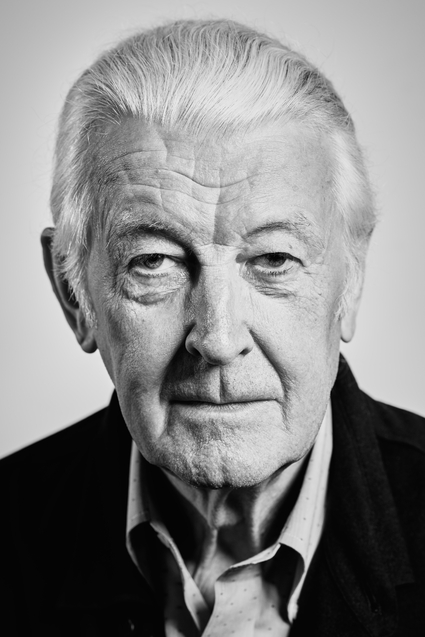
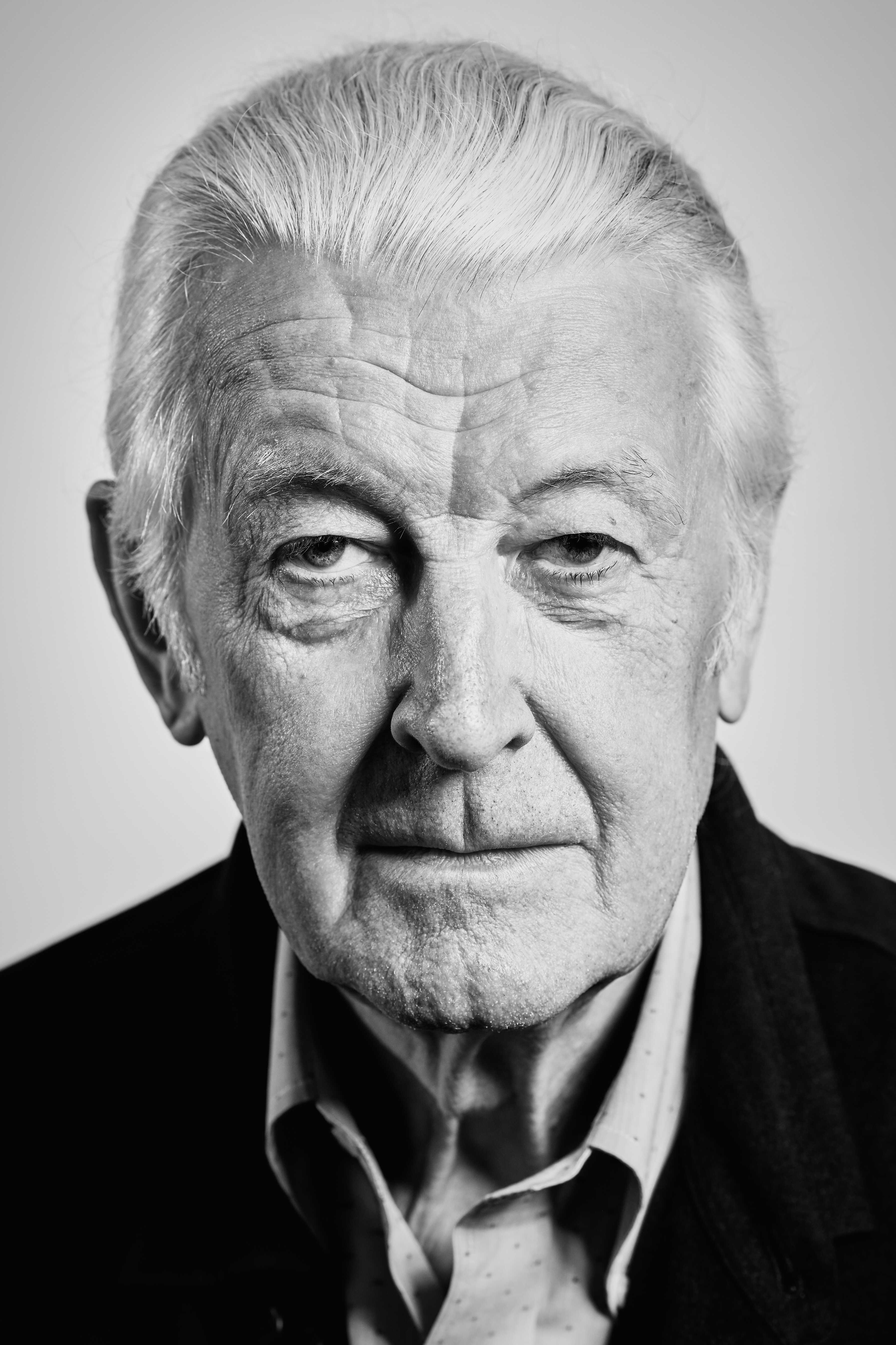
Many of us don't know how much we know about typefaces, or fonts for the further removed. Typefaces for most only occupy a moment of attention when changing document settings. What's more, some don't even stray from Arial. Having said that, you could not live a day without experiencing the impact of them. Typefaces quite literally shape the world of the written word. They determine how we observe, consume, and relate to all non-verbal messages. Unsurprisingly the task of typeface creation and curation falls upon designers, specifically typographers. One such typographer, who has undoubtedly secured his position in the design hall of fame is Matthew Carter. If his name doesn't ring a bell his creations are sure to. Within his oeuvre are the typefaces Verdana, Helvetica Compressed, Olympian, Bell Centennial, and our personal favourite: Georgia.
The scope of his work reflects the great range of technologies he was required to employ. This came as a result of Carter straddling one of the most complex and therefore interesting periods of design to ever occur: the march into the digital world. Throughout the 70’s and 80’s Carter was in a perpetual limbo with the latest digital technology. The rapid changes made every project he participated in a different animal, pushing him to continuously innovate alongside the media itself. Needless to say Carter excelled even in the adverse production conditions that the infancy of digital type provided. He was indeed very conscious of working within the presented constraints but designing without compromise. He understood his typefaces as functions of the systems they were designed to fit.
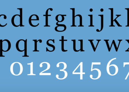
It was with this outlook that Carter joined Microsoft in an effort to create the first purely digital typefaces. Microsoft quite correctly foresaw the movement towards electronic communication, and therefore wanted to create a typeface to be read and written on screen with print as a second layer of importance. Verdana and Georgia were born for the screen and for the problems of screen. Although Carter was unsure if these typefaces could elude obsolescence, we now know that after 26 years they are as relevant as ever.
Reference
My Life in Typefaces. Matthew Carter. Mar. 2014, Accessed 11 Aug. 2023.