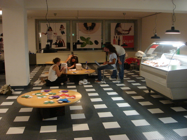
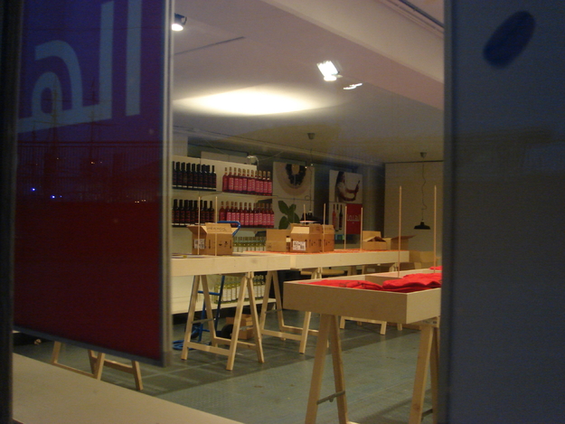
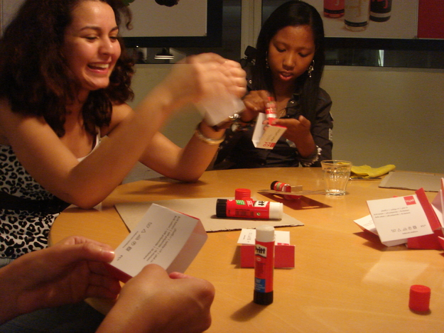
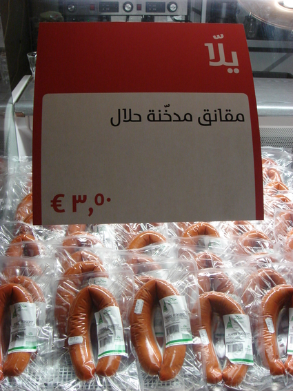
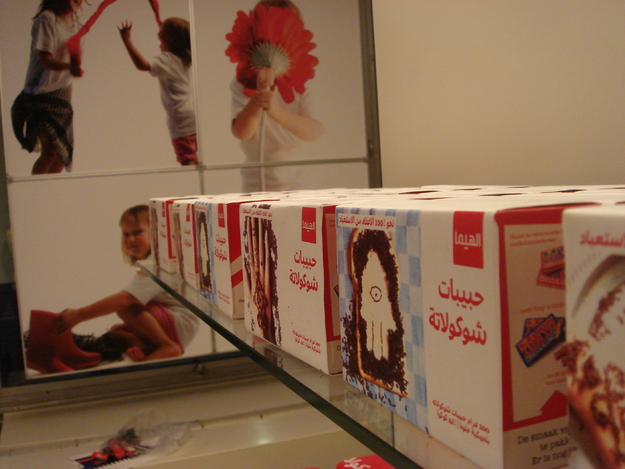
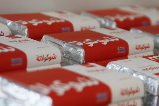
As the staff promptly worked to stitch, glue, spray, saw, post, sew, iron, print and melt the last details for the opening of the El Hema exhibition today, one can’t help wonder how it all began and if things were coming along according to initial plans.
The answer is: of course not.
When the idea for an Arabic font and typography exhibit in the Netherlands first began to germinate nearly three years ago, Khatt, kufi & kaffiya organizer Huda Smitshuijzen Abifares from the Khatt Foundation said she anticipated something “completely different” from the Arabic version of Hema that will now be on display until November 4.
“The [initial] idea was to have an exhibition that would compliment the continuation of the major periods in typography.”
What she got instead were five new typefaces, a new book release, a transitory lawsuit, unforeseen media attention, and five up and coming intern Arab graphic designers—slash, fashion models. But most importantly, she also acquired an incubation for innovative ideas, culture and history that thoroughly conveyed the amalgamation of East and West that she and organizers desired.
In the Beginning
After researching and publishing her first book on typography, Abifares said she wondered what happened to the influence of Dutch punchcutters and type designers on Arabic type, and if the influence was still prevalent in today’s design.
“The answer was no—it’s not valid today.”
With this in mind, an urge to initiate a reciprocal influence developed and conversations for a project began in November 2006. Abifares said the goal was to create a project that would allow Dutch and Arab designers to collaborate ideas and address Arabic cultural misperceptions.
To do so, five teams of two, with one Dutch and one Arab graphic designer per team, were invited to design one font each. This became the Typographic Matchmaking project.
Despite preliminary disparities, an experience such as this can truly bring people together, Abifares said. One obstacle being that type design is typically an individual venture. Nonetheless, the teams “succeeded really well.”
“When you work in the same field, and people are from different cultures you have to trust,” she said. “Because you’re all working on familiar territory it’s difficult and challenging.”
“The challenge of making something together creates for a deeper understanding than simply talking.”
For a year, typographer Pascal Zoghbi worked with Dutch designer Martijn Majoor to create the new Sada/Serial typeface, sharing their knowledge and professional experience to collaborate on the project.
“It was a cultural exchange between Dutch and Arabs.”
Creating Fonts
“They created five completely different designs—dramatically different,” Abifares said.
As with most things, in order to create something new, you have to observe the past. The five teams of designers did precisely this when creating the new typefaces. The documentation of the designers’ process eventually became the basis of the book, Typographic Matchmaking, to be released on the same day as the opening of the exhibit.
The designers researched past typefaces, influences, characteristics and visual modifications of previous decades.
“The idea was not to ‘copy’ Latin shapes of letters, nor to ignore the rules of Arabic typography, but to reflect the history of Arabic calligraphy in a modern way," graphic design intern Wael Morcos said during a past presentation of the new fonts.
The intermingling of the old and the new gives the fonts a “modern feel,” whilst remaining traditional.
The five new fonts Sada, Fresco, Fedra, Big Vesta and The Mix can be used for both reading long texts and for displays, which is rare for Arabic fonts, Morcos said because in Lebanon, not all computers are equipped to produce both readable and aesthetic fonts.
Significance
Mediamatic Director Willem Velthoven once said during a weekly El Hema Thursday meeting that a new type face is not a “very exciting” occurrence for the Dutch. The same can be said about most of the Western world.
But in the Arab world, “it’s a big thing for us because we rarely find good typefaces,” Morcos said.
The creation of five new fonts is significant, Abifares explained, because unlike in the Western world, in Arab countries there are less functional fonts.
“In the West, you can have 20-to-50,000 fonts and about half of them are good,” Abifares said. “But in the Arab world you have about 500—and you can use five of the 500.”
Because Arabic is the second most used writing system in the world after Roman and Latin, Abifares said Arabic should have at least the same number of typefaces—“but that’s not the case.”
Hence, the five new type faces represent not only practical or even an artistic merits, but innovation.
“It’s a typographic development and it means a lot to designers,” Typographer Tarek Atrissi said. Atrissi, along with Dutch Typographer Peter Bilak, designed Fedra font. “In general they [graphic designers] wouldn’t mind having an extra set of good fonts to work with.”
But don’t take their word for it; come and see for yourself.
