To inform our design, we began by thinking about the problem and exploring previous work.
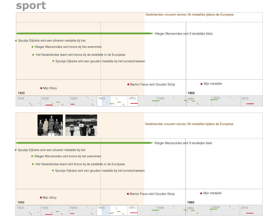
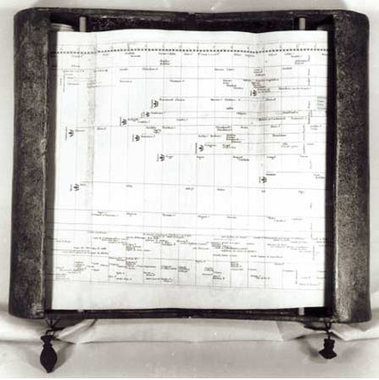
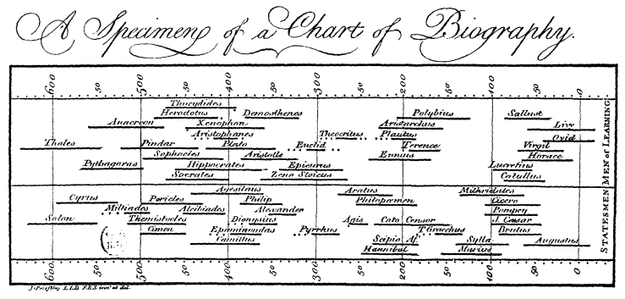
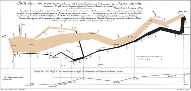
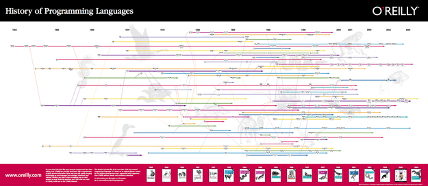
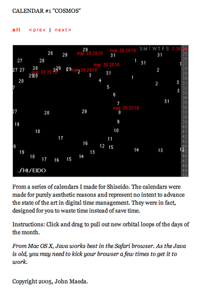
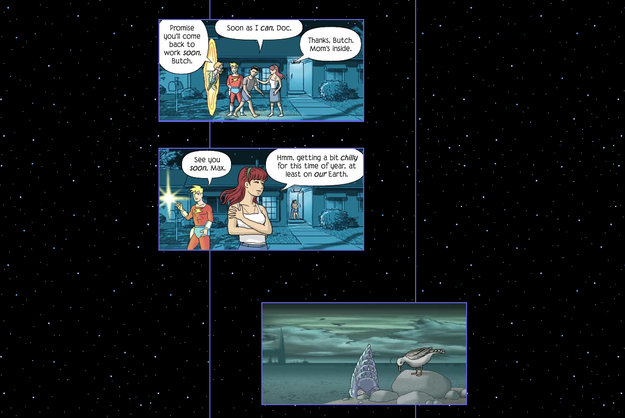
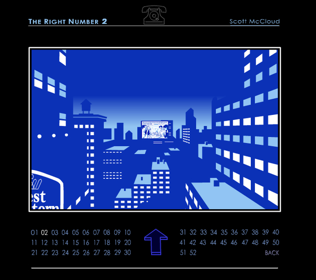
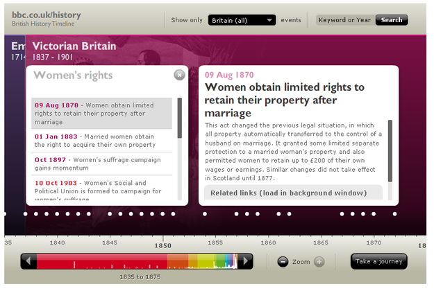
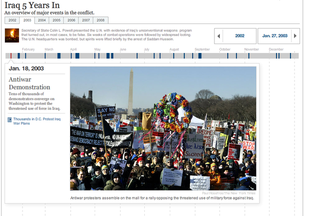
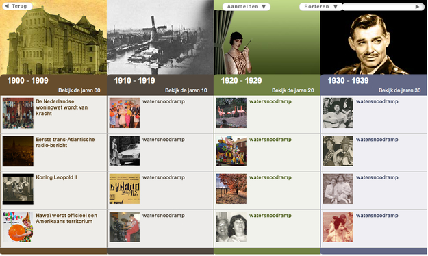
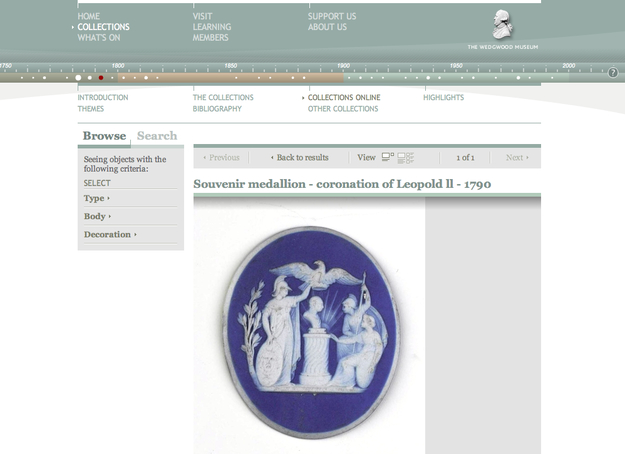
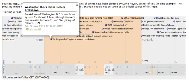
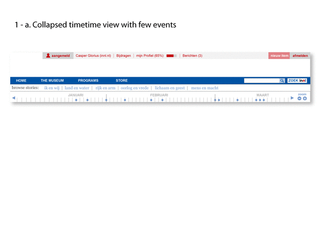
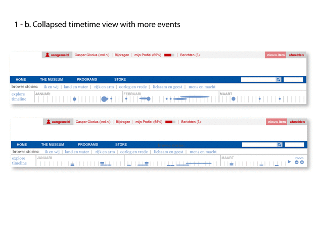
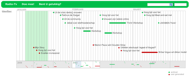
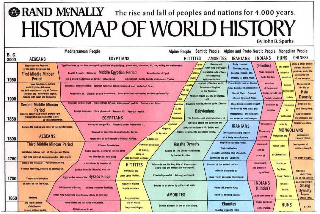
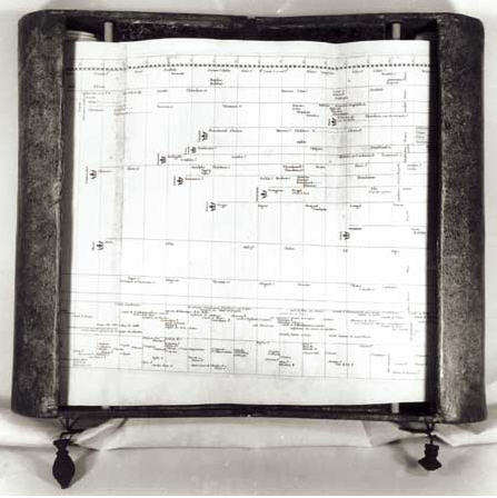
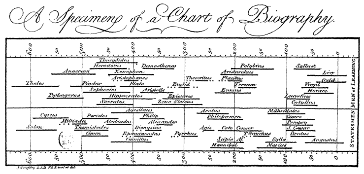
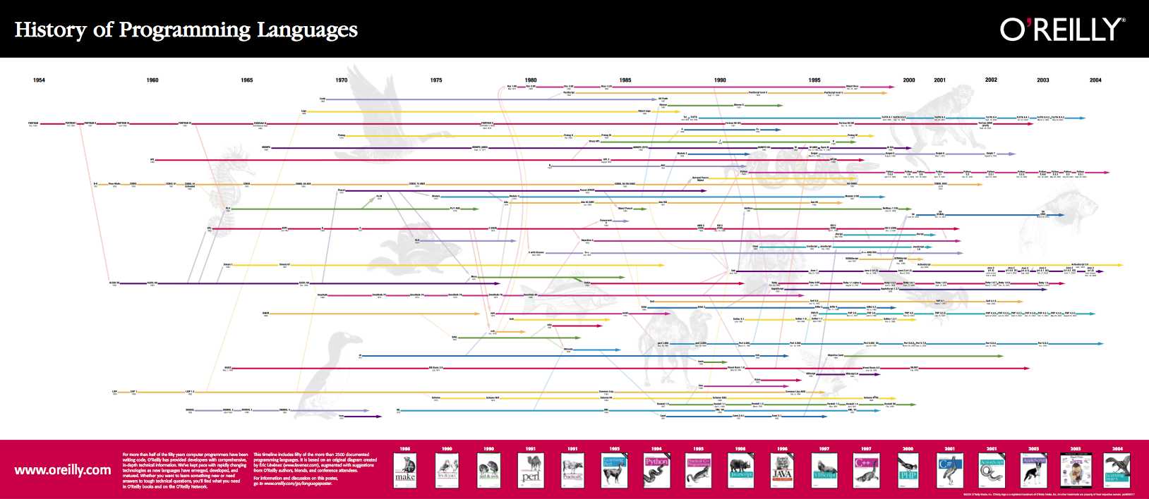
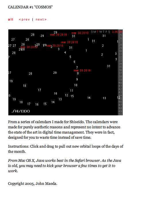
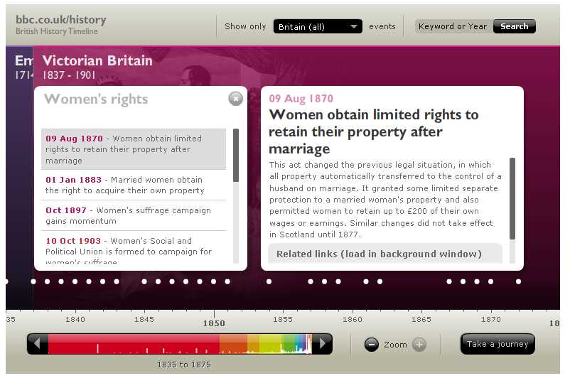
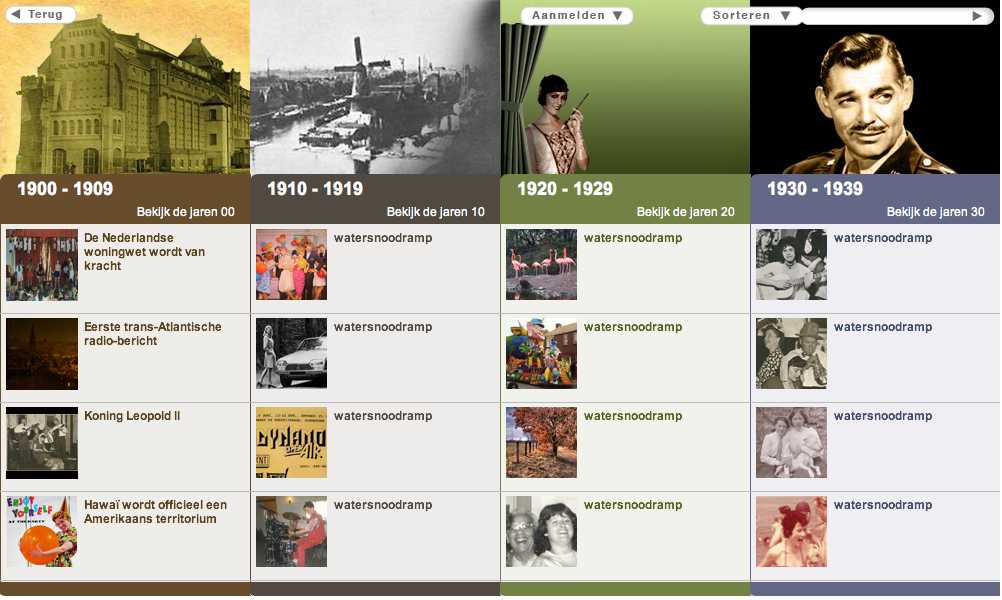
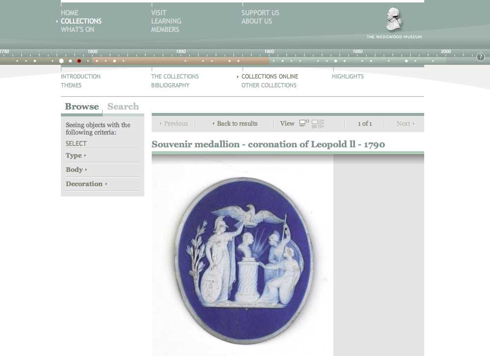
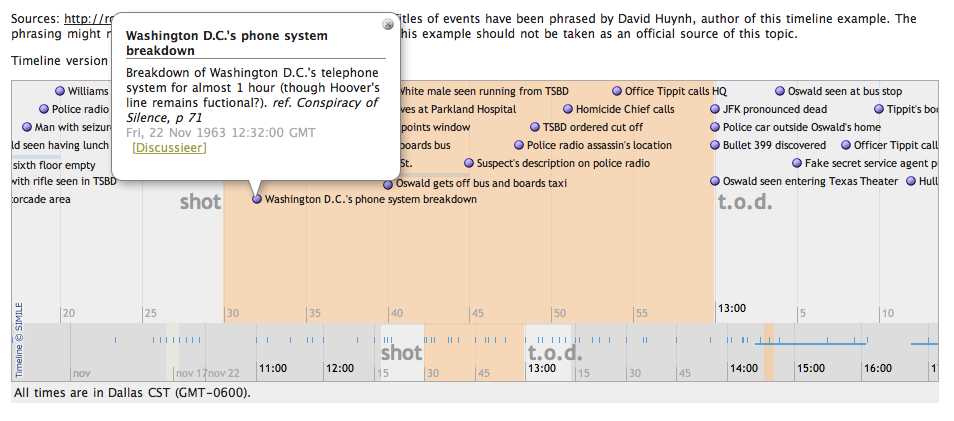
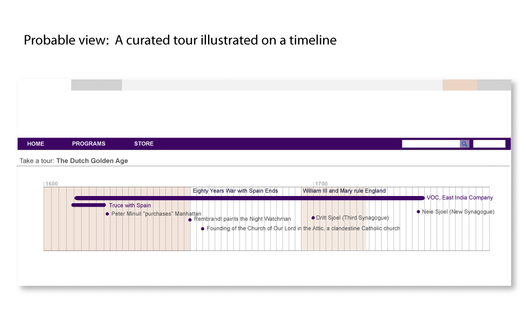
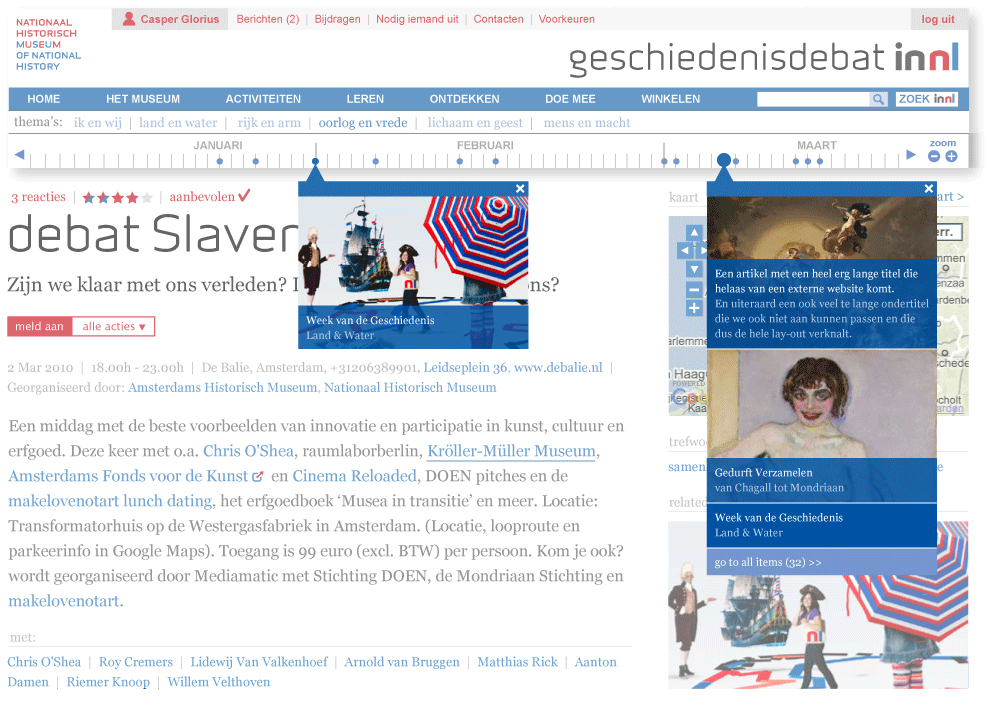
Here’s a quick sampling of timelines in the digital and in some cases print world.
Mediamatic, Lava and our clients RVU and NHM are working to enhance digital storytelling through time-based visualizations. How can we better see and understand our history? How can we add our own understanding to historical events and personal histories?
Contents of this post:
Research existing work:
-Time-based data visualizations
-Contemporary dynamic timelines
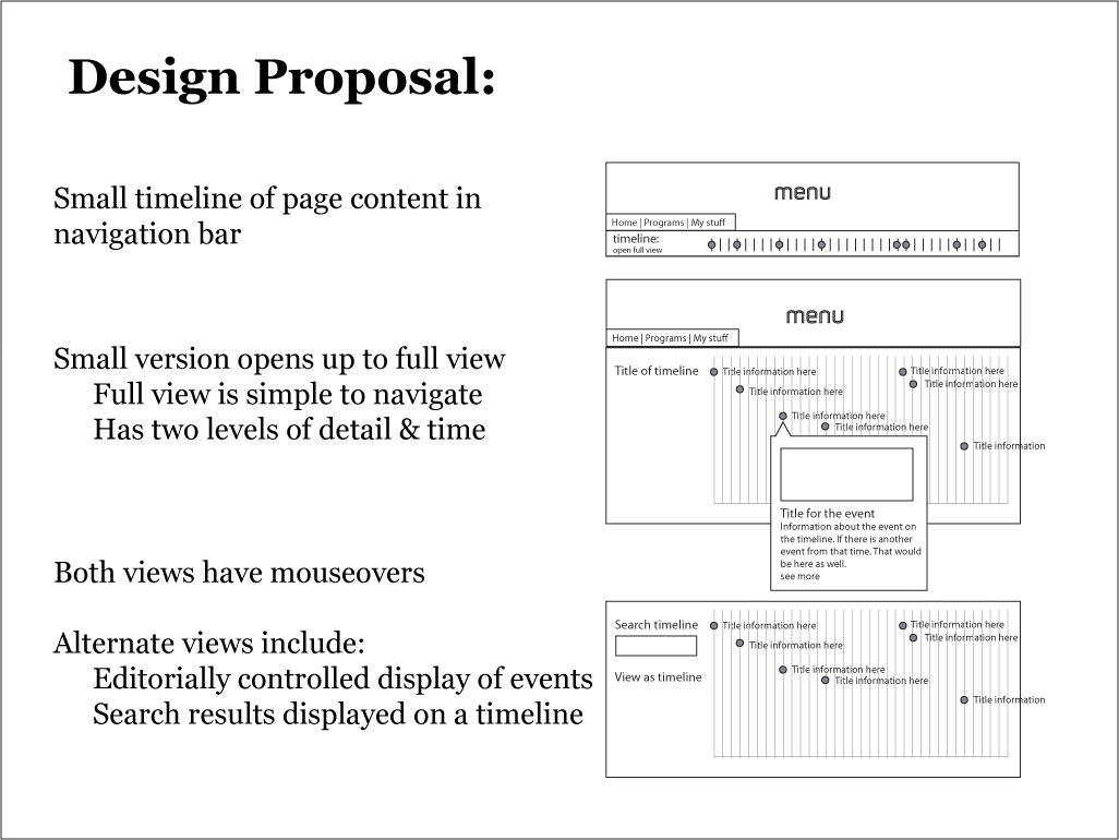
Design proposal and sketches

Timeline Proposal - Sketch of a timeline with and without images.
To inform our design, we began by thinking about the problem and exploring previous work.
Here’s a quick sampling of timelines in the digital and in some cases print world.


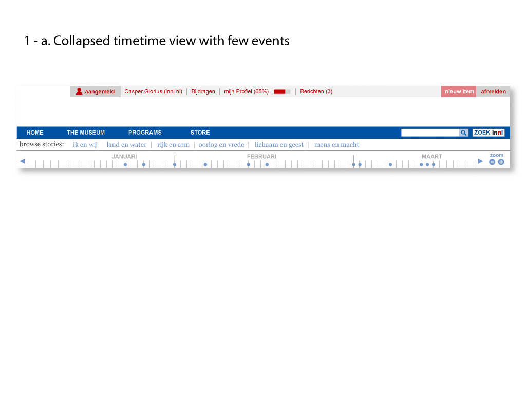
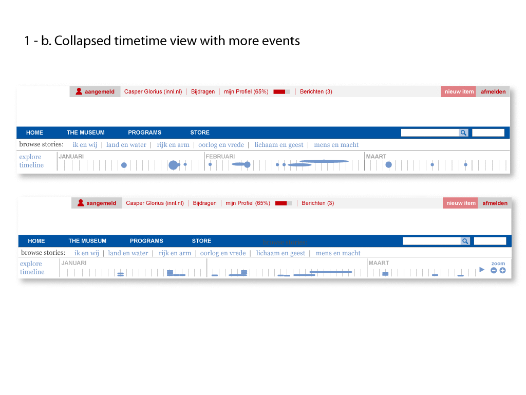
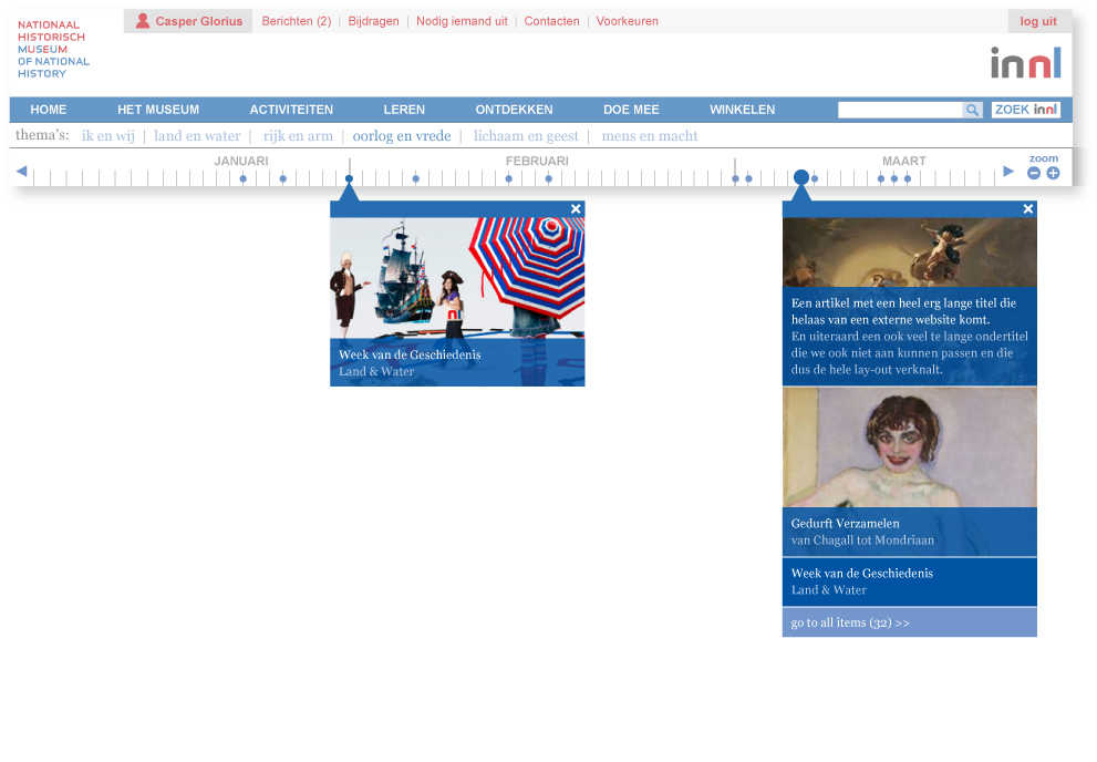
timeline Open - To see more detail, a user can click on the chart to open up a full view.
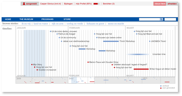
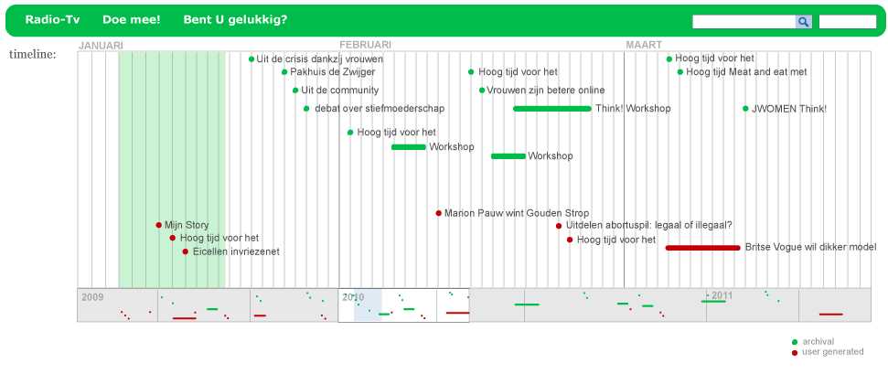
Timeline Open - Sketch for the timeline open with different types of events.
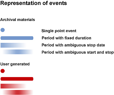
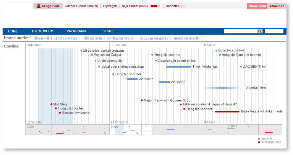
Event Representation - How different types of events could be represented on the timeline
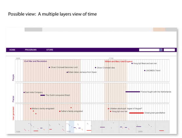
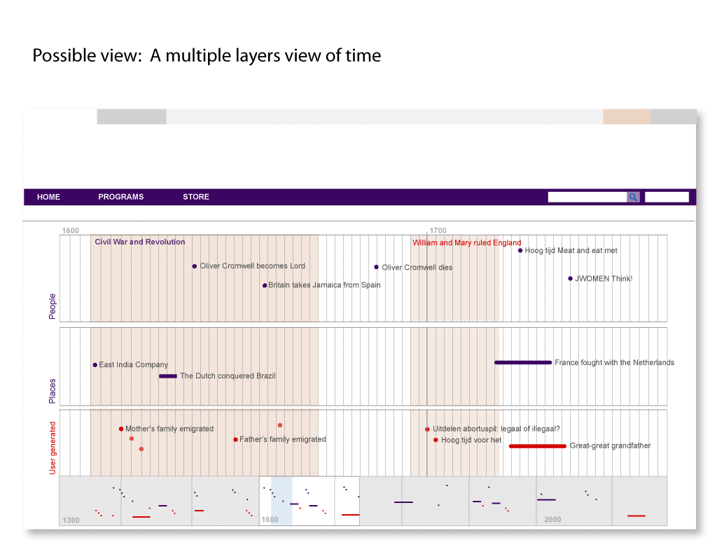
Timeline Open Layers - Alternate view with layers/categories of events.

